 The Stars Group’s online sports betting brand BetStars has the fastest mobile account registration process in the business, according to new research.
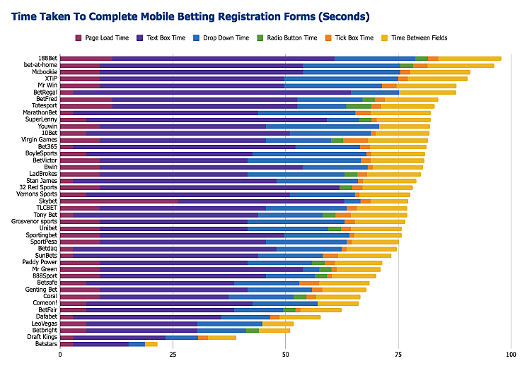
Form analytics platform Formisimo released the results of a study of 43 leading UK and European online gambling companies’ mobile sign-up processes. The study, which was conducted in December 2017, determined that it took customers an average of 77.2 seconds to complete the signup process.
BetStars won the registration speed contest, taking only 21.6 seconds to complete the process. At the other end of the scale, Asian-facing operator 188Bet took a whopping 97.8 seconds. (See full rankings at bottom of the page.) However, Formisimo acknowledges that BetStars streamlines its registration process by ‘backloading’ numerous questions until customers are required to make their first deposit.
Formisimo fingered an excess number of fields as the primary culprit behind slower sign-up speeds, but the number of steps also played a role. For example, Skybet and Vernon Sports had similar speed scores, despite Skybet having four fewer fields. But Skybet had nine separate steps, leading to loading delays as well as punters having to click ‘continue’ to get to the next step.
However, this step reduction can be taken too far, as Marathonbet’s single step process has 19 fields, which Formisimo suggests customers could find “too onerous, and abandon at an early stage.” By contrast, Skybet’s nine steps mean the customer could be far enough along in the process before they find it too onerous, and thus “may feel committed enough to have to complete the process.”
The type of fields also play a significant role. Text input fields took the most time to complete, followed (in descending order) by drop downs, radio buttons and tick boxes. For example, radio button fields take 2.8 seconds to complete, compared to 3.6 seconds for drop downs, and the latter require a minimum of two clicks.
Formisimo also suggests there are rewards for operators who ‘gamify’ long forms by offering customers ‘rewards’ in the form of tick boxes next to a field that indicate a field has been correctly filled. (Insert mandatory observation about snowflake millennials and ‘everybody gets a trophy day’ validation here.)
Formisimo also suggests operators allow customers to view their passwords as they type. Around 56% of the operators studied didn’t offer a ‘show password’ button, and the traditionally complex mixture of letters, numbers and punctuation marks can be hard to get right on a mobile device if users can’t see what they’re typing in real time.
