This is a guest contribution by Wink Bingo & Winkly Magazine’s Marketing Manager Eitan Gorodetsky. If you would like to submit a contribution please contact Bill Beatty for submission details. Thank you.
Branding is one thing, rebranding is another.
 The first is all about who you want to be. A new company trying to establish itself in the marketplace has to cultivate an appearance, creating an impression of what it’s about even as it’s in the process of discovering that for itself. It’s about finding out what the customer wants, and the ways in which you can communicate that that’s what you’re all about. It’s tricky; a deceptively complex hurdle that trips up a lot of fledgling companies.
Rebranding is very different. For an established company it’s not about forecasting what you want to be about, it’s about recognising and demonstrating what you’re already about. When your brand already means something then any attempt to change its presentation has to first and foremost address those pre-existing values. Accurately represent the idea of your business and customers will see the truth behind the aesthetic, but miss the mark and you risk turning them away in droves.
Wink Bingo is one of the longest standing bingo brands in the country, and a name that instantly springs to mind when you think of online bingo. When we began the rebranding process we knew that alongside top quality gaming our customers chose us because we provided a specific look and feel that other sites didn’t. The mission was to build our new look around those unique factors.
Extensive research gave us the three core features of our brand:
1 – We’re a quality site, the choice of those in the know.
2 – We have a fresh, welcoming vibe.
3 – Our players love the sense of community they get from our site.
They’re values we’ve always aimed for, and it was gratifying to know they were the ones that defined us to players. Our new strapline ‘Wink if you’re in’ speaks both to the communal atmosphere of the site and the genuine sense of fun players reported. There’s camaraderie here, but even more than that there’s a shared sense of release and unabashed enjoyment. The idea that we’re a ‘spring’ site is particularly resonant; no matter where you are or how you feel you can visit Wink Bingo to top up your joy.
The idea of opening up a sunny, calm, inclusive space at a moment’s notice was key to our new aesthetic direction. Clutter implies control, that use is directed by the site, so we went in the opposite direction. Bright, simple colours create a space that’s there for our users. They’re free to browse and join games together or apart, while chatting and catching up on the latest news.
We avoided sharp edges, offering a less intrusive design and utilising circles as a key design motif. Not only is the circle a gentle, inclusive shape, but it also fulfils the duel function of bingo ball and spotlight.
Beyond the look and feel of the site we’ve tried to change as little as possible. We’re offering the same great games, the same bingo rooms, and the same promotions, but all in a space that’s tailored to the way our players engage with our services. Knowing our digital space is for players to enjoy themselves, we’ve done our best to keep the site’s workings as familiar as possible.
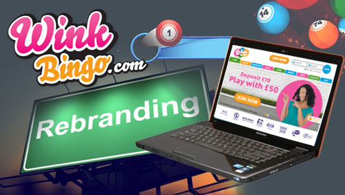
Of course, we’ve taken the opportunity of a rebrand to throw in a few extras. There’s a new welcome offer, where players can deposit £10 to play with £50, and a host of new free games including Winkers Freebie, Free For All, and Weekly £1000. We’ve also used our branding feedback to provide players with the functions they wanted most, adding a ‘Favourite games’ section and a new area to launch chosen bingo and slots games from the web.
The success of any rebranding is in how well you capture the ethos of your service. For us that was about giving our site the vibrant, life-affirming look to match our players’ experiences. We think we did a pretty great job, and hopefully you will too.