 Pokerstars has made a fair number of announcements in the last year or so that they no doubt knew would be seen as bad news by their customers. However, it is their prerogative to run their business as they see fit and increasing rake, decreasing rewards and the like is entirely their choice, even if it effectively kills certain game types.
Clearly, Pokerstars have a PR team working on finding the best way to present these sorts of announcements to the player base in order to try to retain the greatest amount of business and keep profits high. The goodwill that Pokerstars had built up over years of consistently being the frontrunner in poker in all aspects of customer care has quickly been used up and given the content of the changes in question and the stark lack of any real good news to help balance things out, working in Pokerstars PR nowadays is an extremely tough job by anyone’s standards.
The issue is that now that times are tough, the communications department are trying too hard to spin each announcement as a positive change and I believe they have gone too far in their methods, veering into dishonesty and deceit and frankly insulting the intelligence of their customers in attempting to trick them.
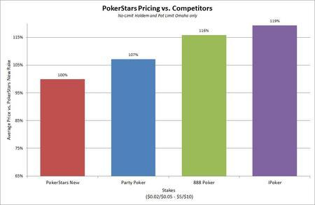
Pokerstars latest announcement, posted on 21st March, detailed significant rake increases in a lot of their games. The decision was taken by their PR team to feature a section in the announcement titled “Comparison With Competitors”, showing an eye-catching chart that appears to show that Pokerstars rake is significantly lower than the competition, even after the changes. However, there are major flaws in what we are presented with and I believe Pokerstars are knowingly displaying poorly collated data in the hope it will be misinterpreted by many.
Here is the chart in question:

What we are looking at is information that has been cherry picked to fit the company rhetoric. It seems clear that Pokerstars first decided to present some information to support their increases and then, only after that decision, began to try to gather some relevant data with a goal of what the results should look like firmly in mind.
Perhaps the most glaring edit is the omission of Pokerstars current rake structure from the comparison altogether. Is it not the case that for players who play on Pokerstars, the rake structure that they are currently used to is the best frame of reference? Of course, when you consider that the inclusion of the current rake on the chart would make the changes look significantly worse, it’s easy to become a cynic.
The failure to include rakeback numbers in the chart has also skewed the way things look. Given the huge cuts to Pokerstars VIP program recently, it is no surprise that they would want to avoid any mention of such figures. It is clear that it is preferable to players to frequent a site where the rake is a little higher and rakeback is significant, rather than one where the rake is a little lower but rakeback is a negligible factor. This sort of system does exist in Pokerstars’ competitors models (40-60% rakeback is widely available on iPoker for instance). Rakeback is an integral part of analysing the overall rake a site charges to play in their games and to exclude it is disingenuous.
Notice that, at the bottom of the chart, we can see that the stakes are restricted to $0.02/$0.05 to $5/$10. If the chart were meant to give a fair overview of the full picture then surely all stakes would be included. Conveniently, the direct take is among least harsh at $5/$10 on Pokerstars, so it is ideal for them for that stake level to be included. However at those stakes there is a lack of any form of rakeback whatsoever, so players would likely be better off with a competitor.
A more unclear part of the chart is what exactly “Average Price” means. There are many ways that an “average” could be used in this case; averaging pot sizes, averaging rake %s, averaging rake cap numbers, averaging total take over stakes, weighting by number of hands per stake, and so on. If I were tasked with coming up with favourable results in this situation, I would calculate several of these in order to find the best looking one which would be chosen for use. The fact that Pokerstars will appear to be the among cheapest (because of the exclusion of rakeback) at the highest stakes included in the sample should mean that many of the cases the figures will be majorly skewed by hands from $5/$10 games.
Perhaps the most galling inefficiency can be seen when you turn your attention to the scale on the Y-axis. The chart does not start from zero, as would be expected, and there is no scale break to highlight this fact. “Zooming in” like this serves to make a small difference look much larger. For example, the green “888 Poker” column in the chart looks approximately 50% taller than the red “Pokerstars New” column, however the numbers that Pokerstars came up with show that it should only be 16% bigger. A fudged scale on a chart such as this would not pass a high school science exam and for a professional data analyst to allow such a clear flaw to be published is appalling.
This one chart is not the only example of Pokerstars attempts to obscure the facts with flawed arguments and insincere presentation. The way details are presented in their announcements is consistently deceptive and the Twitter feeds of their PR team are enraging to read as an informed customer. The prevalence of misinformation and flawed analogies is alarming and it is worrying that a number of less astute players may actually be satisfied with their answers. I hope that my writing here can go some way towards correcting that.
David Vamplew is a professional poker player. You can follow him on twitter @davidv1213.