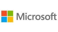
 Microsoft has taken the drastic decision to change its logo for the first time in 25 years. One of the planet’s largest technology firms have revamped their brand for the fifth time this time moving from black and white to world of colour for the first time since February 1987.
“The ways people experience our products are our most important ‘brand impressions’. That’s why the new Microsoft logo takes its inspiration from our product design principles while drawing upon the heritage of our brand values, fonts and colours,” said Jeff Hansen, the company’s general manager of brand strategy.
Brand is something that is hugely important in all business sectors and those in the gambling industry will understand that building and maintaining a strong brand is perhaps the ingredient that will most determine long-term success. It’s no real surprise the move is geared towards growing the brand given that both Apple and Google have given them a kicking in the mobile sector.
The four colored tiles at the centre of the new logo represent the tiles that will be central to the new Windows 8 operating system – which gets its debut on October 26. The new system is designed to work by displaying apps as a mosaic of tiles and work across both tablets and normal bog-standard PCs. It’s here that you realize the effort to harmonize both the brand and OS across all platforms is happening in earnest and it’s something that could place them back alongside long-time rival Apple.
Whilst we’re not suggesting that Microsoft will overhauling Apple’s huge lead in the tablet stakes it’s good to see them revamping their offering to attempt challenging the leaders. Gambling industry firms are likely to assess the new OS before making any great moves to develop native apps for it. Expect to see web-based apps for the time being and if Windows 8 takes off then you’ll likely see gambling industry firms latch onto it.


